Choosing the right backdrop colour can completely change the appearance of a portrait.
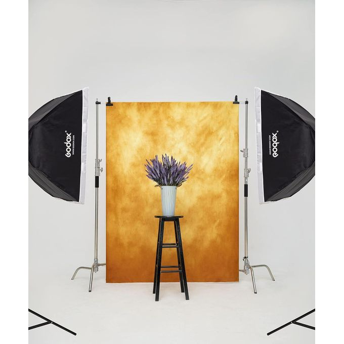
The background affects the subject’s skin tone, clothing, mood, lighting and overall composition. A good backdrop can make a simple portrait look professional, while the wrong colour can make the image feel flat or distracting.
The good news is that you don’t need dozens of backdrops to create beautiful portraits.
With a few versatile colours and an understanding of how colour works, you can create many different looks with the same studio setup.
In this guide, we’ll look at how to choose a backdrop colour for portraits, which colours are the most versatile, and how to choose the right background based on your subject, clothing and lighting.
What Should You Consider Before Choosing a Backdrop Colour?
Before buying or painting a backdrop, consider these factors:
- Skin tone
- Clothing colour
- Type of portrait
- Lighting
- Mood you want to create
- Studio size
- Background material
- How much you plan to edit the images
- Whether the backdrop will be used for photography or video
There isn’t one colour that works perfectly for every portrait.
Instead, choose colours that give you the most flexibility.
1. Gray Is One of the Best Backdrop Colours for Portraits
If you’re buying your first backdrop, gray is one of the safest choices.
Gray is neutral, which means it works with many different clothing colours and skin tones.
It can also be made to look:
- Dark and dramatic
- Bright and clean
- Soft and elegant
- Moody
- Professional
The final appearance depends heavily on how you light it.
A gray backdrop can look significantly different depending on how much light reaches it.
This makes gray particularly useful for photographers who don’t want to buy several backdrops immediately.
Why choose gray?
Gray works well for:
- Headshots
- Corporate portraits
- Fashion
- Birthday portraits
- Men’s portraits
- Women’s portraits
- Editorial photography
- Studio photography
If you’re only buying one backdrop, gray is a very strong option.
2. White Creates a Clean and Bright Look
White is another popular backdrop colour.
It is particularly useful when you want a clean, bright and simple portrait.
White backdrops work well for:
- Beauty photography
- Product photography
- Fashion
- Corporate headshots
- Birthday portraits
- Family portraits
- High-key photography
However, white requires careful lighting.
If you don’t light it properly, a white backdrop can appear gray or uneven.
If you deliberately light the background separately, you can create a bright white background while keeping your subject properly exposed.
One important advantage
White is easy to manipulate during editing.
You can often change the appearance of the background more easily than you could with a heavily patterned or textured backdrop.
3. Black Creates Dramatic Portraits
Black is excellent when you want a dramatic or luxurious look.
It can create strong separation between the subject and the background, particularly when the subject is wearing lighter clothing.
Black works especially well for:
- Men’s portraits
- Fashion
- Editorial photography
- Dramatic portraits
- Birthday portraits
- Luxury branding
- Low-key photography
However, black clothing against a black backdrop can cause the subject’s clothing to disappear into the background.
This isn’t necessarily bad.
It can actually be a creative effect.
You can also use a rim light or hair light to separate the subject from the background.
4. Beige and Cream Create a Soft, Elegant Look
Neutral warm colours such as:
- Beige
- Cream
- Tan
- Warm ivory
can create a soft and sophisticated appearance.
These colours are particularly useful for:
- Women’s portraits
- Birthday photography
- Maternity photography
- Lifestyle portraits
- Beauty photography
- Family portraits
They can also work well with warm skin tones and earth-tone clothing.
If you’re creating a luxury portrait setup, beige or cream can be an excellent alternative to plain white.
5. Brown Creates a Warm and Earthy Feel
Brown backdrops can give portraits a warmer, more artistic appearance.
They work especially well with:
- Cream clothing
- White clothing
- Black clothing
- Earth tones
- Gold accessories
- Warm lighting
Brown can also work beautifully for editorial and fashion portraits.
A darker brown backdrop combined with controlled lighting can create a sophisticated studio look.
6. Blue Can Make Portraits Look Modern
Blue is another useful backdrop colour.
Depending on the shade, blue can create very different moods.
Light blue
Can feel:
- Fresh
- Soft
- Bright
- Youthful
Dark blue
Can feel:
- Dramatic
- Professional
- Elegant
- Cinematic
Blue can also create strong contrast with warm-coloured clothing.
For example, orange, yellow and warm brown clothing can stand out against a blue background.
7. Green Can Work Well for Creative Portraits
Green isn’t necessarily the first backdrop colour most photographers buy, but it can be very effective.
Different shades create different results.
Olive green
Works well for:
- Fashion
- Editorial
- Earthy portraits
Dark green
Can create:
- Luxury
- Drama
- Cinematic mood
Bright green
Can be useful for creative photography and chroma-key work, although a dedicated green-screen setup has different requirements from a normal portrait backdrop.
If your goal is ordinary portrait photography, muted greens are often easier to work with than extremely bright green.
8. Red Creates a Strong and Energetic Look
Red is a powerful colour.
It immediately attracts attention, which makes it useful for creative and fashion portraits.
Red can work particularly well for:
- Birthday shoots
- Fashion
- Music artists
- Editorial portraits
- Valentine’s-themed photography
- Promotional campaigns
However, red can overpower the subject if it is too bright.
If you want a more sophisticated look, consider deeper shades such as:
Burgundy
Wine
Deep red
rather than an extremely bright red.
9. Pink Works Well for Beauty and Birthday Portraits
Pink can create a soft, playful or fashionable appearance.
Depending on the shade, it can work for:
- Beauty portraits
- Birthday shoots
- Fashion
- Maternity
- Children’s portraits
- Creative portraits
Soft pink can create a gentle appearance, while hot pink creates a much more energetic fashion look.
10. Purple Can Create a Luxury or Creative Mood
Purple can be very effective for creative portraits.
Dark purple can create a luxurious and dramatic appearance, while lighter purple can feel softer and more playful.
Purple can work particularly well when combined with:
- Blue lighting
- Pink lighting
- Magenta lighting
- Warm highlights
However, because purple is a strong colour, you’ll want to pay attention to the subject’s clothing.
How to Choose a Backdrop Based on Clothing
One of the easiest ways to choose your backdrop is to consider what your subject is wearing.
You generally want enough contrast between the subject and the background.
For example:
Black clothing
Try:
- Gray
- White
- Beige
- Cream
- Red
- Blue
White clothing
Try:
- Gray
- Black
- Brown
- Blue
- Green
- Dark red
Red clothing
Try:
- Gray
- Black
- Cream
- Beige
- Dark blue
Blue clothing
Try:
- Gray
- White
- Beige
- Cream
- Brown
Green clothing
Try:
- Beige
- Cream
- Gray
- Brown
- Black
This isn’t a strict rule.
Sometimes intentionally matching the clothing and background can produce an interesting editorial look.
How to Choose a Backdrop for Different Skin Tones
Backdrop colour can affect how skin appears in photographs.
However, there isn’t a single backdrop colour that is “best” for a particular skin tone.
Lighting, white balance and colour grading have a major influence.
Instead of thinking:
“Which colour is best for this skin tone?”
think:
“Which colour gives me enough separation and creates the mood I want?”
Neutral colours such as gray, beige, cream and brown are generally easy starting points because they don’t introduce extremely strong competing colours into the scene.
How Lighting Changes Your Backdrop Colour
Your backdrop isn’t going to look exactly like it does in the shop.
Lighting can dramatically change its appearance.
For example, a gray backdrop can appear:
Light gray
Medium gray
Dark gray
depending on how it is illuminated.
You can also use coloured lights to change the mood.
For example:
Blue light + gray backdrop = cool cinematic appearance
Red light + gray backdrop = dramatic appearance
Warm light + beige backdrop = soft luxury appearance
This means you don’t necessarily need to own every colour.
A neutral backdrop combined with creative lighting can give you many different looks.
Should You Buy Fabric, Paper or Canvas?
The material of your backdrop matters too.
Paper Backdrops
Paper backdrops are useful when you want a clean, seamless studio background.
Advantages:
- Smooth surface
- Minimal texture
- Good for clean portraits
- Easy to light evenly
The downside is that paper can tear or become damaged.
Fabric Backdrops
Fabric backdrops are popular because they’re relatively easy to transport and store.
They’re useful for:
- Home studios
- Outdoor shoots
- Portable setups
- Events
However, wrinkles can become visible if the fabric isn’t stretched or steamed properly.
Canvas Backdrops
Canvas can create a more artistic appearance.
They are particularly useful when you want:
- Painted textures
- Vintage appearance
- Editorial portraits
- Fine-art portraits
- Custom colours
Canvas can also be painted yourself if you want a completely custom backdrop.
For example, you could paint a dark gray canvas and add subtle beige or brown tones to create a textured studio background.
What Is the Best Backdrop Colour If You Can Only Buy One?
If you’re starting your studio and can only buy one backdrop, I’d recommend:
Medium gray
Why?
Because you can make it appear darker or lighter depending on your lighting.
It works with many clothing colours.
It works for men and women.
It can be used for both bright and dramatic portraits.
And you can easily change the mood using lighting and colour grading.
Other excellent one-backdrop choices include:
Cream/beige if you want a warm luxury look.
White if you mainly want clean, bright portraits.
Black if your style is dramatic and moody.
How Many Backdrops Does a Beginner Need?
You don’t need 10 or 20 colours when you’re starting.
I’d recommend building your collection gradually.
A practical starting set could be:
1. Gray
Your most versatile option.
2. White or cream
For bright and clean portraits.
3. Black
For dramatic portraits.
4. One creative colour
For example:
Brown, blue, red, green or pink.
Once you understand how your clients and lighting work, you can add more colours.
Don’t Forget About Background Separation
The colour of your backdrop isn’t the only thing that matters.
The distance between your subject and the background can dramatically change the photograph.
Try moving your subject away from the backdrop.
This can:
- Reduce shadows
- Create better separation
- Make the background softer
- Give you more control over lighting
If you’re using a wide aperture such as f/1.8 or f/2, moving the subject farther from the background can also make the background appear more blurred.
A Simple Backdrop Colour Cheat Sheet
| Backdrop | Best For | Overall Feel |
| Gray | Almost everything | Neutral & professional |
| White | Beauty, headshots, clean portraits | Bright & clean |
| Black | Men, fashion, dramatic portraits | Moody & luxurious |
| Beige | Women, birthdays, lifestyle | Warm & elegant |
| Brown | Editorial, fashion | Earthy & sophisticated |
| Blue | Fashion, portraits | Modern & cinematic |
| Green | Creative/editorial | Artistic & natural |
| Red | Fashion, birthdays, music | Bold & energetic |
| Pink | Beauty, birthdays | Soft & playful |
| Purple | Creative/fashion | Luxurious & dramatic |
Final Thoughts
Choosing a backdrop colour doesn’t have to be complicated.
Start by thinking about the subject, clothing, lighting and mood you want to create.
If you’re building your first portrait studio, don’t feel pressured to buy every colour available.
A good gray, white/cream and black collection can cover a huge range of portrait styles.
Once you understand how lighting changes the appearance of your backgrounds, you can create even more variety without constantly buying new backdrops.
And remember:
The best backdrop colour isn’t necessarily the most beautiful colour. It’s the colour that helps your subject stand out and supports the story you’re trying to tell.
Frequently Asked Questions
What is the best backdrop colour for portrait photography?
Gray is one of the most versatile choices because it works with many subjects, clothing colours and lighting styles.
Is black or white better for portraits?
Neither is universally better. White creates a clean and bright appearance, while black creates a darker and more dramatic look.
What backdrop colour is best for dark skin tones?
Neutral colours such as gray, cream, beige and brown can work very well, but lighting and contrast are more important than choosing a colour based solely on skin tone.
What backdrop should I buy first?
If you’re buying only one, a medium-gray backdrop is a strong starting point because you can make it appear lighter or darker through lighting.
Can I use a fabric backdrop for professional photography?
Yes. Fabric can produce excellent results when it is properly stretched, steamed and lit.
Is canvas good for portrait backdrops?
Yes. Canvas is particularly useful if you want painted, textured or artistic backgrounds.
How far should my subject be from the backdrop?
Whenever possible, leave some distance between the subject and backdrop. This gives you more control over shadows, background brightness and separation.
Can I change my backdrop colour in Photoshop?
Yes. A clean, evenly lit background is generally easier to modify in post-production than a complicated or heavily textured background.